What is overprinting?
Creating dimension in a one-dimensional print project can take some creative brainpower. Generally, printed items are planned with colors that do not use overprinting, or print on top of each other, as this can sometimes cause an unexpected effect or colors to look “muddy.”
With overprinting, however, you intentionally mix colors together by printing one on top of the other to form an interesting level of dimension and new color results. While the final result depends on how your project is implemented, overprinting can provide a measure of depth that is often missing in projects that are printed on a flat piece of paper.
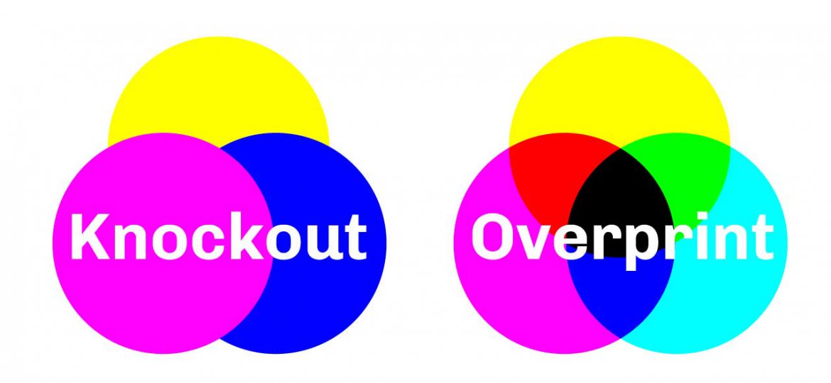
Knockout versus Overprint
Traditional design software automatically creates a knockout of any text or lines that are overlapping one another, so you’re able to see the crisp, clear edges in your printed product just as you see them on your screen. The knockout effect uses the top-most object’s art only and ignores all art or objects below the top object.
When colors are overprinted, or overlapped, you have the opportunity to create an additional color. While knockout text can be impactful, overprinting adds some dimension or thickness to the paint. This slight trick of thickness makes the image appear to jump off the page and creates a completely new look from traditional printing.
Order of Colors Matters
One thing that’s important to keep in mind with overprinting is that the order in which the colors are applied to the canvas matters. If you’re purposefully overprinting several colors, you wouldn’t want to design your project with the lightest color in the back, for instance. The darker foreground color could easily overwhelm the lighter shade, causing an unexpected result. The colors will be printed in exactly the same order as the artwork, which is why it is critical to have someone who truly understands design and printing create your artwork to ensure a consistent result for your printed materials.
Just like every other creative approach to printing, you don’t want to go overboard with overprinting. However, when used judiciously, you can create intriguing designs that would be much more difficult or expensive were you to use traditional printing techniques. A perfect example is with Pantone colors where there might be a charge for each color. With overprinting techniques, you can technically get a third color without having to pay for an additional imprint.
[…] apply overprinting to any elements in artwork intended for digital print, as digital employs knockout printing methods. If overprinting is built into the file, the overall design will appear correctly on your screen, […]