6 Rules for Good Font Readability
Good typography in marketing materials keeps both font readability and legibility in mind. While font readability means exactly what you think it means: easy to read and understand, legibility means having sufficient contrast with a background (for example, not putting white text on a yellow background).
It’s important to understand what things affect the readability of your type. Scientists have measured eye movement and comprehension and verified these five rules that you should use when selecting type font and size for your marketing materials.
- Keep typography simple
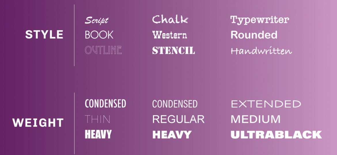
Selecting one font family for your entire printed piece makes it easier for the eye to decipher when glancing across the page. Choose a font that has many different weights, sizes, and styles to use for headings, quotations, or to emphasize a particular section. Build variety playing with these variables instead of switching between multiple font families. - Stay consistent
Consistency will lend authority to the look of your piece and will become part of your branding for that particular item. Therefore, be sure that all of the headers look the same, including size and font type. The same goes for sub-headers, pull-quotes, etc. - Use upper and lower case
Using standard upper and lower case letters make the wording easier for people to read. This format is also what readers are familiar with and expect to see. While you can use all capital letters for emphasis in rare cases, it is not a good idea for regular print. This rule has more to do with how people read then the look or style of your design. - Keep lines short
Shorter lines of text tend to be more readable than longer lines. It’s recommended that readers make less than two eye movements per line, and people tend to read three to four words per eye movement. With this in mind, experts suggest setting line length at approximately 39 characters, limiting lines of copy to six to eight words. Flyers, billboards, and posters will work best with short, bulleted points. - Properly set the leading
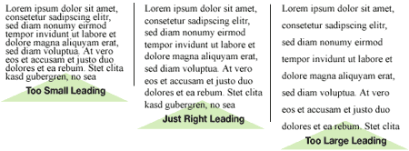
The leading, or space between each line of text, also affects readability. In general, leading that is 2-3 points larger than the typeface enhances readability. Leading that is too much larger or smaller than that, however, can make the type more difficult to read.
- Use serifs
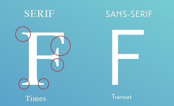
Serifs are the little, extra strokes or flourishes at the end of the main strokes of a letter. Research shows that serif fonts are more readable than sans serif fonts for large areas of body text. This may be due to the serifs’ ability to lead the eye from one character to the next. On the other hand, typefaces with serifs that are too pronounced can have the opposite effect. Also, sans serif fonts tend to be more readable than their serif counterparts in smaller point sizes, such as those used for footnotes or fine print.
Your readers can catch every word when you consider the readability of your type in your next marketing project.
[…] a design, it’s essential to choose a typeface as it impacts the user experience, legibility, readability, and overall aesthetics. You may find yourself mired in the serif vs. sans-serif argument, no […]
[…] The leading, or space between each line of text, also affects readability. In general, leading that is 2-3 points larger than the typeface enhances readability. Leading that is too much larger or smaller than that, however, can make the type more difficult to read. via […]