For printed materials, the optimal point size when choosing a font for print is between 10-12 points, however legibility at this size can vary greatly between different typefaces. Always print out your project at 100% size (without scaling) to determine if the font size is legible for your printed project.
Things to Consider
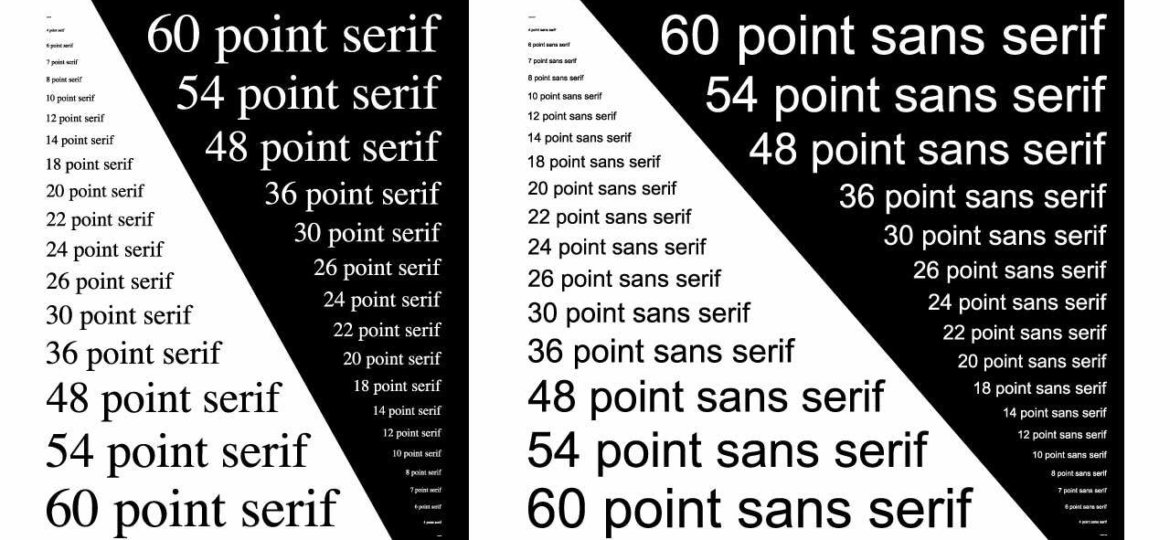
Point Size
- Most printed materials use a font size between 10 or 11 points. The default font size in many word processing programs is 12 point type, which is larger than necessary for print.
- Printed projects are easier to read with consistent font sizes for body copy and headlines. We recommend creating a style guide for your brand that defines the font typefaces, sizes and colors to use across your printed materials for consistency.
- Don’t judge font size on a screen. Due to varying resolution and zoom, computer screens do not always accurately depict font size. Make sure to review font size on a printed proof.
- Consider your audience when selecting a font size. If your target audience is likely wearing reading glasses, you may want to opt for a larger font size.
- Type that is smaller than 7 points can be difficult to read, and is not recommended for body copy. Legal copy like copyright and trademark information typically uses 6 point type.
- Some printed materials, like packaging, may have font size regulations. Make sure to verify any laws or regulations in your industry to ensure your printed project is compliant.
Font Style
There are a large number of typefaces to choose from when designing a printed project. Here are a few tips to consider:
- Verify your font choices are legible at both small sizes and large sizes. This is especially important if you intend to use the same font across all of your marketing materials for consistency. Consider: Will it work on a business card? Will it work on a billboard?
- There are many font resources on the web where you can try out new fonts. We recommend https://www.dafont.com, a website with free fonts available for download where you can preview your text while reviewing font typefaces.
- White space is very important for legibility. Make sure you leave plenty of room between lines of copy (called “leading”) to make it easier to read blocks of text.
Font Color
- Use 3 or fewer of the CMYK colors for type smaller than 22 points. When you use multiple ink colors in a small font, the chances increase of the colors not lining up when the copy is printed, called “mis-registration”. This can make the text appear blurry or create a shadow effect, making the copy less legible.
- Black copy on a white background is the easiest to read. When trying out different colors and backgrounds, make sure to review a printed proof to verify the text is legible.
- When designing a project, make sure to account for people whose vision may be worse than yours. A quick trick is to squint or step back 4 feet and see if you can still read your text. If not, you may want to adjust the colors or increase the font size.
 Plum Grove
[…] Plum GroveChosing a Font for Print […]
[…] For printed materials, the optimal point size when choosing a font for print is between 10-12 points, however legibility at this size can vary greatly between different typefaces. Always print out your project at 100% size (without scaling) to determine if the font size is legible for your printed project. via […]
[…] For printed materials, the optimal point size when choosing a font for print is between 10-12 points, however legibility at this size can vary greatly between different typefaces. Always print out your project at 100% size (without scaling) to determine if the font size is legible for your printed project. via […]
[…] https://plumgroveinc.com/choosing-a-font-for-print-2/ […]